
Overview
The Rail Strip blueprints provided are in three groups:
-
Standard
-
Magazine
-
Promotional
|
Standard |
Magazine |
Promotional |
|
|---|---|---|---|
|
|
|

|
(2:3 & 4:3) |
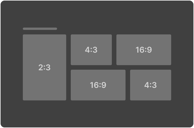
(2:3 Hero / Alternating 4:3 & 16:9 Dual Row) |
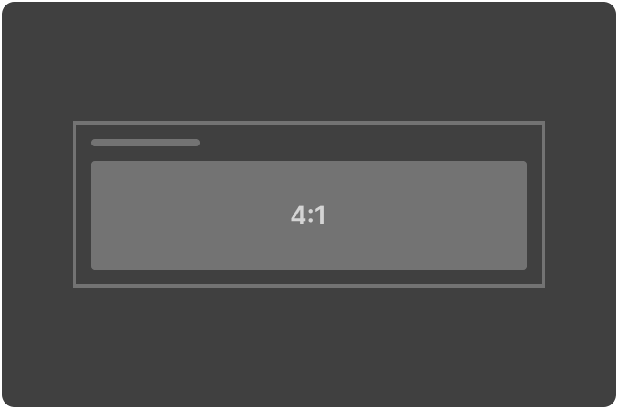
(4:1 Dual Row) |
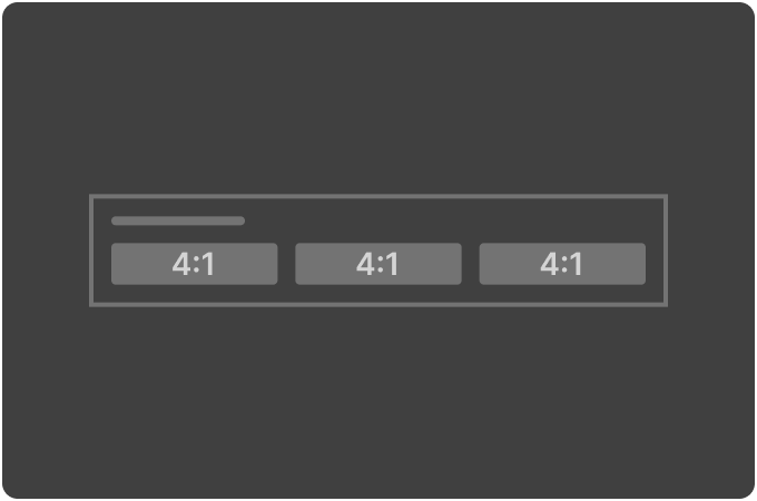
(4:1 Dual Row) |
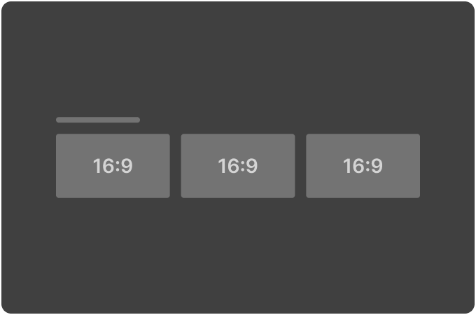
(16:9)
|
(4:3 & 16:9 Dual Row / 2:3 Hero)
|
(3:1 Dual Row) |
|
(4:3)
|
(2:3 Single Row) |
(4:1 Dual Row) |
(3:1) |
|
|
|
|
(4:1) |
Standard Strip configuration
Use this table to help you complete the configuration fields when creating or editing a predefined Standard Strip variant.
|
Field |
Purpose |
Values |
Description |
Example usage and notes |
|---|---|---|---|---|
|
Type |
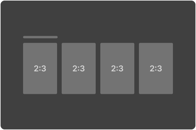
Type defines the rail (strip) type. |
standard_strip
|
A rail that is single height and multi-tile. It typically represents a basic linear content strip with tiles of uniform height (width can vary if required). |
|
|
Layout Style |
Layout Style defines how the rail is presented to the user. It provides guidance on the display format and interaction style, helping the client to organize and showcase content effectively. |
standard
|
The standard layout presents tiles in a linear, continuous style, allowing users to scroll left or right freely without boundaries. This style is best for displaying a large volume of content in a seamless, uninterrupted scrolling experience. The focus is on smooth, continuous navigation. |
A long list of movies or shows that users can scroll through without limitations |
|
Client Context |
N/A |
|
|
|
|
Tile Pattern |
Tile Pattern defines the layout and aspect ratio of tiles within the rail. The selected pattern, which may consist of a combination of aspect ratios, is repeated across the rail and can accommodate duplicate tiles. |
default |
The tile pattern is dynamically determined by the client, meaning the client has full control over how the tiles are arranged. |
|
|
16x9
|
These are fixed aspect ratios for tiles. You can specify multiple ratios, and they will be repeated across the rail in the order selected. |
If you select a single aspect ratio: [4x3] The result is: [4x3] [4x3] [4x3]… If you select multiple aspect ratios: [4x3] [16x9] The result is: [4x3] [16x9] [4x3] [16x9]… If you select multiple aspect ratios with duplicates: [4x3] [4x3] [16x9] [16x9] The result is: [4x3] [4x3] [16x9] [16x9]… |
||
|
Show More |
Show More is used to display a “Show More” link or button within the rail. This link allows users to navigate to a separate screen or view that is specific to the rail content, offering more detailed or expanded options. This is typically used when the content in the RAIL exceeds the initial set of items shown, and the user can view more items in a dedicated section. The actual placement, behaviour and flow of the “Show More” functionality (for example, the navigation to the next screen or the content load mechanism) is not defined within this blueprint and must be implemented by the client as needed.
|
True |
Displays the Show More link or button, allowing the user to load additional content or navigate to a more detailed view. |
|
|
False |
Hides the Show More link, limiting the user to the initially displayed content without offering the ability to view more. |
|
||
|
Max Pages |
Max Pages defines the maximum number of pages that can be retrieved for the rail. This allows clients to control the number of results displayed within the rail, offering more control over how much content is shown at once. |
0 |
No restriction on the number of pages. The client can continue retrieving pages until no more are available, allowing for an infinite or uninterrupted content stream. |
The Max Pages value is an absolute maximum. If the total number of items is less than the maximum, the client will only retrieve what is available. If Max Pages is set to a specific limit and more content exists, the Show More field can be used to allow the user to break out from the rail into a separate page where the Max Pages limit is no longer applied. This would allow access to more content beyond the specified Max Pages restriction. |
|
1 or more |
The client is restricted to retrieving no more than the specified number of pages. If the rail can display more content, the client must stop retrieving additional pages once the limit is reached. |
|||
|
Visible |
Visible defines whether to show or hide a rail without removing it from the template or layout. |
True |
The rail will be displayed to the user within the layout. |
|
|
False |
The rail will be hidden from view but still remains part of the template. |
It can be toggled back to True later without needing to modify the layout or template structure. |
||
|
Scroll Type |
N/A |
|
|
|
|
Edge Peek |
N/A |
|
|
|
|
Tile Style |
N/A |
|
|
|
Magazine Strip configuration
Use this table to help you complete the configuration fields when creating or editing a predefined Magazine Strip variant.
|
Field |
Purpose |
Values |
Description |
Example usage and notes |
|---|---|---|---|---|
|
Type |
Type defines the rail (strip) type. |
standard_strip
|
A rail that is single height and multi-tile. It typically represents a basic linear content strip with tiles of uniform height (width can vary if required). |
|
|
Layout Style |
Layout Style defines how the rail is presented to the user. It provides guidance on the display format and interaction style, helping the client to organize and showcase content effectively. |
dual_row_hero_grid
|
A large hero tile that spans both rows at the beginning of the rail, followed by smaller grid-style tiles. Hero tiles can repeat throughout the layout, acting as focal points, while the grid tiles present additional content in a more compact, uniform format. |
|
|
dual_row_grid_hero |
The grid layout is displayed first, with 2 rows of smaller tiles, followed by a large hero tile that spans both rows. Hero tiles can repeat throughout the layout, acting as focal points, while the grid tiles present additional content in a more compact, uniform format. |
|
||
|
single_row_grid |
A simple single row grid layout with no hero tiles. Tiles will be double height. |
|
||
|
Client Context |
N/A |
|
|
|
|
Grid Tile Pattern |
Grid Tile Pattern defines the layout and aspect ratio of tiles within the rail. The selected pattern, which may consist of a combination of aspect ratios, is repeated across the rail and can accommodate duplicate tiles. When combined with hero tiles, the pattern is repeated as part of the overall layout, ensuring consistency in how tiles appear throughout the rail. |
default |
The grid tile pattern is dynamically determined by the client, meaning the client has full control over how the tiles are arranged. |
|
|
16x9
|
These are fixed aspect ratios for tiles. You can specify multiple ratios, and they will be repeated across the rail in the order selected. When combined with hero tiles, the pattern is repeated as part of the overall layout, ensuring consistency in how tiles appear throughout the rail.
|
If you select a single aspect ratio: [4x3] The result is: [4x3] [4x3] [4x3]… If you select multiple aspect ratios: [4x3] [16x9] The result is: [4x3] [16x9] [4x3] [16x9]… If you select multiple aspect ratios with duplicates: [4x3] [4x3] [16x9] [16x9] The result is: [4x3] [4x3] [16x9] [16x9]… If you select a combination with repeating hero tiles: 4x3, 16x9, (hero tiles) The result is: [4x3] [16x9] [Hero] [4x3] [16x9] [Hero] .. If you select a combination with non-repeating hero tiles:
The result is: [4x3] [16x9] [Hero] [4x3] [16x9] [4x3] [16x9] ....
|
||
|
Grid Tile Pattern Invert |
Grid Tile Pattern Invert allows for the inversion of the aspect ratio pattern across rows within a 2-row grid. When set to True, the aspect ratios specified for each row in the Grid Tile Pattern are inverted between the rows. This simplifies the configuration for alternating aspect ratios between two rows, where the pattern in row 1 is swapped for row 2, creating a visually dynamic effect. |
True |
When set to True: The pattern specified for row 1 is inverted in row 2. |
For example, if row 1 is configured as 4x3, 16x9, the result for row 2 would be 16x9, 4x3. |
|
False |
When set to False: The pattern defined in Grid Tile Pattern will be applied consistently across both rows, without inversion. |
|
||
|
Hero Tile Aspect Ratio |
Hero Tile Aspect Ratio specifies the aspect ratio for the hero tile within a rail layout. The hero tile is typically a larger, more prominent tile designed to draw attention, often placed at the top or highlighted within a section. In a configuration where there are two rows, the hero tile is always intended to span both rows for a greater visual impact.
|
default
|
The aspect ratio of the hero tile is dynamically determined by the client, giving full control over how the hero tile is rendered. |
|
|
16x9 4x3 3x2 2x3 4x5 1x1 |
These are fixed aspect ratios for tiles. |
|
||
|
Hero Tile Repeat |
Hero Tile Repeat controls whether the hero tile appears multiple times within the grid layout, or just once, providing flexibility for layouts with either a single or multiple hero tile. |
True |
The hero tile will be inserted repeatedly in the grid layout, appearing at multiple positions according to the selected tile pattern. |
This is useful when multiple hero tiles are needed across the rail for visual consistency or emphasis. |
|
False |
The hero tile appears only once, typically spanning multiple rows at the top of the rail, providing a singular, prominent visual. |
|
||
|
Show More |
Show More is used to display a “Show More” link or button within the rail. This link allows users to navigate to a separate screen or view that is specific to the rail content, offering more detailed or expanded options. This is typically used when the content in the RAIL exceeds the initial set of items shown, and the user can view more items in a dedicated section. The actual placement, behaviour and flow of the “Show More” functionality (for example, the navigation to the next screen or the content load mechanism) is not defined within this blueprint and must be implemented by the client as needed.
|
True |
Displays the Show More link or button, allowing the user to load additional content or navigate to a more detailed view. |
|
|
False |
Hides the Show More link, limiting the user to the initially displayed content without offering the ability to view more. |
|
||
|
Max Pages |
Max Pages defines the maximum number of pages that can be retrieved for the rail. This allows clients to control the number of results displayed within the rail, offering more control over how much content is shown at once. |
0 |
No restriction on the number of pages. The client can continue retrieving pages until no more are available, allowing for an infinite or uninterrupted content stream. |
The Max Pages value is an absolute maximum. If the total number of items is less than the maximum, the client will only retrieve what is available. If Max Pages is set to a specific limit and more content exists, the Show More field can be used to allow the user to break out from the rail into a separate page where the Max Pages limit is no longer applied. This would allow access to more content beyond the specified Max Pages restriction. |
|
1 or more |
The client is restricted to retrieving no more than the specified number of pages. If the rail can display more content, the client must stop retrieving additional pages once the limit is reached. |
|||
|
Visible |
Visible defines whether to show or hide a rail without removing it from the template or layout. |
True |
The rail will be displayed to the user within the layout. |
|
|
False |
The rail will be hidden from view but still remains part of the template. |
It can be toggled back to True later without needing to modify the layout or template structure. |
||
|
Scroll Type |
N/A |
|
|
|
|
Edge Peek |
N/A |
|
|
|
|
Tile Style |
N/A |
|
|
|
|
Spanned Row Details |
N/A |
|
|
|
Promotional Strip configuration
Use this table to help you complete the configuration fields when creating or editing a predefined Promotional Strip variant.
|
Field |
Purpose |
Values |
Description |
Example usage and notes |
|---|---|---|---|---|
|
Type |
Type defines the rail (strip) type. |
standard_strip
|
A rail that is single height and multi-tile. It typically represents a basic linear content strip with tiles of uniform height (width can vary if required). |
|
|
Layout Style |
Layout Style defines how the rail is presented to the user. It provides guidance on the display format and interaction style, helping the client to organize and showcase content effectively. |
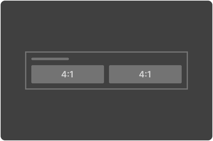
triple_height |
A simple single-row, triple-height layout. |
|
|
dual_height |
A simple single-row, double-height layout. |
|
||
|
single_height |
A simple single-row, single-height layout. |
|
||
|
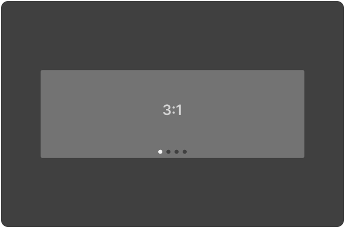
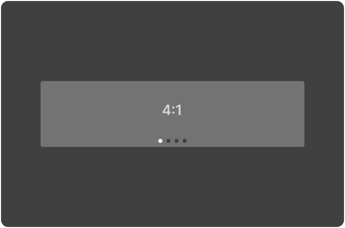
Carousel |
Carousel is a special layout variant designed to show a limited number of items at a time (typically 3-5). It emphasizes a more organized or featured display, often showcasing highlighted content or key items. Carousels are commonly used for promotions, featured items, or spotlight content. Depending on the client’s navigation style, a carousel may include navigation controls, such as:
|
|
|
Carousels are ideal for highlighting specific content, ensuring that the user’s attention is drawn to a select few items within the strip.
The carousel layout is highly flexible, and the navigation controls (arrows, dots) are not defined in this blueprint but should be implemented as needed by the client. |
|
Client Context |
N/A |
|
|
|
|
Tile Pattern |
Tile Pattern defines the layout and aspect ratio of tiles within the rail. The selected pattern, which may consist of a combination of aspect ratios and duplicates, is not repeated across the rail.
|
default |
The tile pattern is dynamically determined by the client, meaning the client has full control over how the tiles are arranged. |
|
|
16x9
|
These are fixed aspect ratios for tiles. You can select a combination of aspect ratios and duplicates to create the pattern, which is definitive and will NOT repeat across the rail.
|
If you select a single aspect ratio: [4x3] The result is: [4x3] If you select multiple aspect ratios: [4x3] [16x9] The result is: [4x3] [16x9] If you select multiple aspect ratios with duplicates: [4x1] [4x1] [16x9] The result is: [4x1] [4x1] [16x9]
|
||
|
Visible |
Visible defines whether to show or hide a rail without removing it from the template or layout. |
True |
The rail will be displayed to the user within the layout. |
|
|
False |
The rail will be hidden from view but still remains part of the template. |
It can be toggled back to True later without needing to modify the layout or template structure. |
||
|
Tile Style |
N/A |
|
|
|