
Overview
OpenTV Platform enables you to define pages (templates) of content and strips (rails) of content within each page. These pages can be organised into a hierarchy, which means that you can define the navigation structure of all your applications' content pages in one place. The pages and their contents are defined in Rails Builder, which is part of Operator Console (OpCon).
A client application queries Content Delivery to get the template hierarchy, individual templates, and the individual rails and presents them as part of its user interface. This section of the client integration guide explains how to do this.
It is organised into the following main sections:
-
This page – explains the main rails concepts and terminology
-
Rails use cases explains how the client queries Content Delivery to get the template hierarchy, templates, and rails.
-
Interpreting template hierarchy, template, and rails responses explains how the client should interpret the Content Delivery responses to render the pages correctly.
-
Rails best practices explains how best to work with rails to ensure that the client makes efficient requests and that client integration goes smoothly.
Basic rails concepts
A template hierarchy consists of multiple templates. Each template contains one or more rails.
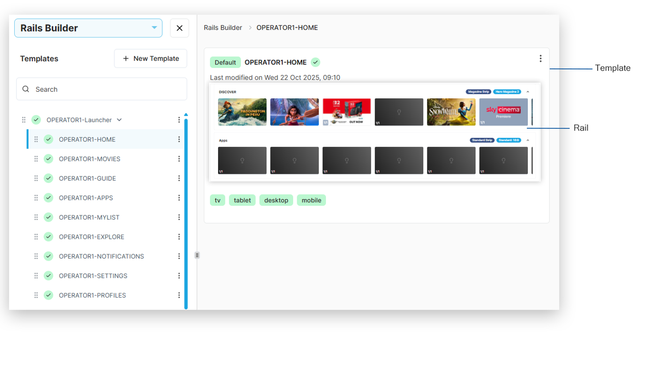
Templates
A template represents a screen in your application. For example, there may be a template for each of the following
-
Home screen
-
Movies screen
-
Guide (EPG) screen
-
Explore screen
Although Rails Builder allows you to add more than one layout to a template, you should not do this.
If you need to target content to different device types, use segment targeting at the rail level.
Rails and rail sections
A rail can consist of one or more rail sections. For example, a single rail could contain the following sections:
-
A promotional banner
-
Three curated content items
-
Five recommended content items
Although these are added to the rail as three sections in Rails Builder, the response that the client receives from Content Delivery will simply include nine section blocks, one for each item that the client needs to render in the rail.
Blueprints
Both templates and rails can have blueprints applied to them. Blueprints at the template level are a legacy feature.
A blueprint defines a type of strip (rail). It includes a set of parameters that define how a rail that is based on it should be presented.
Typically, all rails will be created from blueprints, as they inform the client application how the rail is to be laid out and presented.
Each defined blueprint can have one or more instances, each of which defines a specific version of the blueprint.
For example, there is a predefined blueprint called Magazine Strip. And there are predefined instances of Magazine Strip called Large Poster Magazine and Hero Magazine 1.
Similarly, for the predefined blueprint type called Promotional Strip, there are instances called Single Promotion: 3:1 Dual Height Row and Double Promotion: 4:1 Dual Height Row.
When a rail is created, it is based on an instance of a blueprint, that is, one of the following:
-
Using a predefined blueprint:
-
A predefined instance of the predefined blueprint
-
A custom instance of the predefined blueprint
-
-
Using a custom blueprint:
-
A predefined instance of the custom blueprint
-
A custom instance of the custom blueprint
-
-
Not using a blueprint at all (legacy/classic rail)
Custom components
A custom component is a component with specific functionality that can be added to any rail in the same way as content is added. For example:
-
An ad banner
-
An application launcher
-
A feature banner
As with blueprints, there are both custom components and specific instances of each custom component.
Each of these items, when included in a rail response, includes the target that the client should navigate to if the user clicks or taps the item:
-
For an ad banner, the ad server URL
-
For an app launcher, the platform-specific package ID
-
For a feature banner, the ID of the template (page in the client app) to be navigated to
Key/value pair groups
A key/value pair group is a common configuration element that can be used to extend the definition of a rail/strip.
As with blueprints, there are both key/value pair groups and specific instances of each key-value pair group.
After a rail has been created, one or more key/value pair group instances can be added to it.
For example, there are predefined key/value pair groups for:
-
Branding – includes an image and a brand name for adding branded elements to a rail/strip
-
Logo (rail) – includes a logo image that the client should add to the rail
-
Logo (content) – includes a logo image for content and fields that indicate the positioning and opacity of the logo
-
Android Channels API – includes a setting that maps content to Android TV’s native channel system
Note that a rail/strip with an instance of this key/value pair group will not usually have any content – it will be populated by channels from the Android Channels API.
Note that you can only add an instance of a key-value pair group to a specific rail. You cannot add one to a blueprint or blueprint instance.
Ad-hoc key/value pairs
In addition to key/value pair groups, a rail can have ad-hoc key/value pairs. These are referred to as Additional Properties in the OpCon UI.
Ad-hoc key/value pairs were typically used to provide client applications with details about how to render rails before blueprints existed.