
Overview
A magazine strip defines a rail that is double-height, multi-tile, and can optionally contain hero tiles that span multiple rows. This type is often used for layouts where the content is presented in a magazine-style format, with visually impactful tiles (e.g., hero tiles) that stand out and occupy more space compared to the other smaller tiles.
Example configurationProperties response
For a rail that uses a magazine strip blueprint (in this case, the Hero Magazine 1 instance), the rail’s configurationProperties block looks like this.
...
"configurationProperties": {
  "client_context": [
    "double height",
    "uniform",
    "2x3 hero"
  ],
  "hero_tile_repeat": true,
  "edge_peek": true,
  "instance": "Hero Magazine 1",
  "layout_style": "dual_row_hero_grid",
  "visible": true,
  "grid_tile_pattern": [
    "4x3"
  ],
  "type": "magazine_strip",
  "scroll_type": "infinite_scroll",
  "grid_tile_pattern_invert": false,
  "hero_tile_aspect_ratio": "2x3",
  "tile_style": "default",
  "spanned_row_navigation": "directional",
  "max_pages": 0,
  "show_more": false
},
 ...
Fields
The following table lists the fields that are specific to magazine strip blueprints. (SeeRail reponses for a full list of rail fields.)
A custom instance of the magazine strip might use any of the available values in the table.
A built-in instance will use specific values as listed in Magazine strip instances, below.
|
Keys |
Type |
Values |
Description |
|---|---|---|---|
|
|
static |
|
The
|
|
|
enum |
|
The
|
|
|
enum selector (duplicates on, re-ordering on) |
|
The
Examples:
|
|
|
boolean |
|
The
|
|
|
enum |
|
The
|
|
|
boolean |
|
The
|
|
|
boolean |
|
The
Notes:
|
|
|
numeric (0 to 1000) |
|
The
The If Example Usage:
|
|
|
boolean |
|
The
|
Magazine strip instances
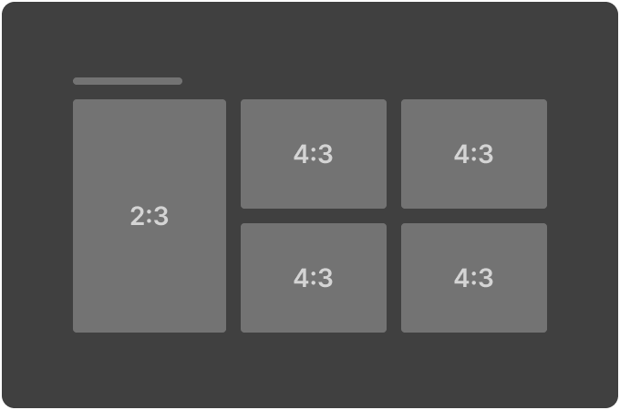
Hero Magazine 1 (2:3 Hero / 4:3 Dual Row)
|
Appearance |
Key |
Values |
|
|
|
|
|
|
|
|
|
|
|
|
|
|
|
|
|
|
|
|
|
|
|
|
|
|
|
|
|
|
|
|
|
|
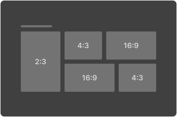
Hero Magazine 2 (2:3 Hero / Alternating 4:3 & 16:9 Dual Row)
|
Appearance |
Key |
Values |
|
|
|
|
|
|
|
|
|
|
|
|
|
|
|
|
|
|
|
|
|
|
|
|
|
|
|
|
|
|
|
|
|
|
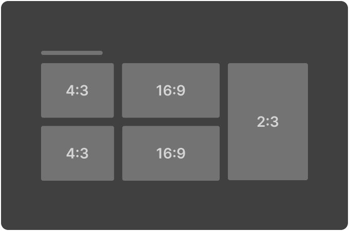
Hero Magazine 3 (4:3 & 16:9 Dual Row / 2:3 Hero)
|
Appearance |
Key |
Values |
|
|
|
|
|
|
|
|
|
|
|
|
|
|
|
|
|
|
|
|
|
|
|
|
|
|
|
|
|
|
|
|
|
|
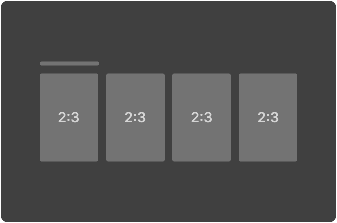
Large Poster Magazine (2:3 single row)
|
Appearance |
Key |
Values |
|
|
|
|
|
|
|
|
|
|
|
|
|
|
|
|
|
|
|
|
|
|
|
|
|
|
|
|
|
|
|
|
|
|