
Overview
This page explains the fields that are returned when you make a request to Retrieve a specific rail and its contents.
The client needs to check for the presence of the following in the rail response and act accordingly:
-
A blueprint
-
A custom component
-
A key/value pair group
The client needs to do this in addition to reading and rendering the content items in each rail.
Note that the content within the rail / rail section may be filtered on the head end (for example, according to age ratings, entitlements, or other rules).
Procedure
The procedure is shown in the following flowchart and the steps below:
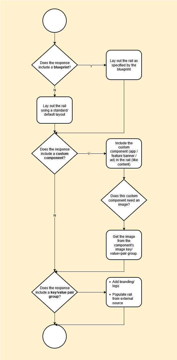
-
To check if the response includes a blueprint, the client needs to:
-
Check if the rail has a
configurationPropertiesblock. -
If it does, check the value of the
typefield:-
standard_strip– display the rail as a standard strip (single height, multi-tile) – see Standard strips. -
magazine_strip– display the rail as a magazine strip (double height, multi-tile, optionally containing hero tiles that span multiple rows) – see Magazine strips. -
promotional_strip– display the rail as a promotional strip (for highlighting featured or time-sensitive content) – see Promotional strips.
-
-
-
To check if the response contains a custom component, the client needs to:
-
Check for items in the rail’s
sectionsblock that have atypeofNonContentItem. -
If there are, check the value of the type field in the object’s
configurationPropertiesfield:-
advertisement_banner– add an ad banner to the rail – see Advertisement banner custom component. -
application– add an application to the rail – see Application custom component. -
preinstalled_application– add a pre-installed application to the rail – see Pre-installed application custom component. -
feature_banner– add a feature banner to the rail – see Feature banner custom component.
-
-
If the custom component is of a type that requires an image, check if the section also contains an
extendedAttributesblock.
If so, check if the key/value pair group that the block represents is an external image or an internal image:-
internal_image– see Internal Image key/value pair group. -
external_image– see External Image key/value pair group
-
-
-
To check if the response includes key/value pair groups, the client needs to:
-
Check if the rail has an
extendedAttributesblock. -
If it does, check the value of the
typefield in each of the objects in theextendedAttributesblock (there may be more than one):-
logo_configuration_rail– add a logo to the rail – see Logo (RAIL) key/value pair group. -
logo_configuration_tile– add a logo to each item in the rail – see Logo (Content) key/value pair group. -
promo_banner– place a banner image in the rail and navigate to the provided URL if the user clicks on it – see PromotionalBanner key/value pair group. -
internal_image– used in conjunction with the first three key/value group types to specify where to get the required image – see Internal Image key/value pair group. -
external_image– used in conjunction with the first three key/value group types to specify where to get the required image – see External Image key/value pair group. -
android_channels_api– populate the rail using the Android Channels API – see Android Channels API key/value pair group.
-
-
Example response
A rail response looks like this.
The sections block is collapsed here to save space.
{
  "blueprintId": "a2b21c00-0741-4b70-b1ce-c7b327788026",
  "blueprintName": "Magazine Strip",
  "configurationProperties": {
    "client_context": [
      "double height",
      "alternating",
      "2x3 hero"
    ],
    "hero_tile_repeat": true,
    "edge_peek": true,
    "instance": "Hero Magazine 2",
    "layout_style": "dual_row_hero_grid",
    "visible": true,
    "grid_tile_pattern": [
      "4x3",
      "16x9"
    ],
    "type": "magazine_strip",
    "scroll_type": "infinite_scroll",
    "grid_tile_pattern_invert": true,
    "hero_tile_aspect_ratio": "2x3",
    "tile_style": "default",
    "spanned_row_navigation": "directional",
    "max_pages": 0,
    "show_more": false
  },
  "name": "DISCOVER",
  "title": null,
  "layout": "Landscape",
  "properties": {
    "ui_layout": "magazine_1"
  },
  "sections": [
    ...
  ],
  "hasNext": true,
  "id": "0b3003b3-e3b8-4115-a7a9-6713848dc676",
  "session": {
    "id": "0fbe46a3366aa2a16ca6e7383a02e561fa01d72d27e16ea5f88c5fca3065607f",
    "expires": 1771945281
  }
}
Fields
The following tables explain:
-
The top-level fields that are returned in a rail response
-
The fields within the
sectionsblock -
The different section types and how to handle them
Top-level fields
The following table lists all the top-level fields and blocks that are returned in a rail response.
|
Field |
Description |
Meaning/actions |
|---|---|---|
|
|
The ID of the blueprint that the rails is based on (if any) If the rail is not based on a blueprint, this field will be empty. |
|
|
|
The name of the blueprint that the rails is based on (if any) If the rail is not based on a blueprint, this field will not be present. |
|
|
|
This block specifies the details of the blueprint that the rail is based on. If the rail is not based on a blueprint, this block will not be present. |
The client should use the contents of this block to lay out and style the rail. See the flowchart and procedure above for details. |
|
|
The name of the rail |
The client should display this as the title of the rail if |
|
|
The rail title |
If |
|
|
The default image orientation |
Use this value for all rails in the layout, unless:
|
|
|
Other properties for the rail |
These were typically used to instruct the client on how to present the rail before blueprints were introduced. |
|
|
The sections that the rail includes. |
What the client should display and the possible interactions depend on the section |
|
|
Whether there is more content available for the rail. |
In the rail response, the |
|
|
The ID of the rail |
No action required |
Section fields
The following table lists all the fields and blocks within the objects within the sections block.
|
Field |
Description |
Meaning/actions |
|---|---|---|
|
|
Other properties for the section |
These were typically used to instruct the client on how to present the rail before blueprints were introduced. |
|
|
The actual contents of the section |
Each object within this block represents an item of the type specified by the section’s The fields within this block contain a large amount of metadata about the content, much of which is the same as that provided by a media card. Only certain metadata are required to display the item in the rail, such as:
For the full list of fields and blocks, see the get rail endpoint in the Content Delivery API documentation. |
|
|
The section type |
What the client should display and the possible interactions depend on the section |
Section types
The following table lists the different section types and what the client should do if the user clicks on an item:
|
Content category |
Type |
Description |
User interaction |
|---|---|---|---|
|
Single content item |
|
A single content item, such as a movie or an episode of a series |
If the user clicks/taps on one, the client can either play the content immediately (if the user has entitlements for the content) or display a media card. (This is a UX design decision – the behaviour is not prescribed by OpenTV Platform.) For a content item without entitlements (such as a TVOD item that has not yet been purchased or rented), the client could display the media card with options to buy, rent, or buy/subscribe to a product that includes the content. The media card endpoints responses include details of the products that include the content. |
|
|
A transactional VOD item |
||
|
|
A content item that the user has recorded |
||
|
|
A content item that the user has favourited |
||
|
Multiple content items |
|
A list of content that the user stopped watching part way through |
The client application should present each item in the list/group as a single item. If the user clicks on one of the items, the client should handle it in the same way as a single content item (above). If the list itself includes sub-lists or groups (for example, a node can contain another node or a collapsed season/series), the client should enable the user to drill down. For example:
For a To do this, it must get the bookmark for the item to find out where to resume playback. See Get a single bookmark for a content item. |
|
|
A list of content that the user has recently watched |
||
|
|
A list of content that is recommended based on content that the user has watched |
||
|
|
A list of recommended content (usually based on the user’s activity, but can also be based on other parameters) |
||
|
|
A group of content Note that a node can be hierarchical – a node can contain other nodes. In nodes, series and seasons are collapsed by default. |
||
|
|
A collection of content based on a search query |
||
|
|
A list of content items (matching search results) in a search rail. (See Searching using search rails.) |
||
|
Single or multiple content items |
|
A season of a series It can either be expanded (i.e., containing the season’s episodes) or collapsed (i.e., consisting of a single season object). |
If a series or season is expanded, the rail includes the individual episodes, which the client should handle as a single content item (see above). If a series or season is collapsed, the section includes only the series or season(s). If the user clicks on a series or season, you can use the series/season ID to request the appropriate series/season media card. Series/season content groups are collapsed by default. |
|
|
A TV series It can either be expanded (i.e., containing the episodes in the series) or collapsed (i.e., consisting of a single series object). |
||
|
Products |
|
A single purchasable product |
|
|
Live TV |
|
A scheduled broadcast event with start and end times |
How the client handles user interaction depends on the timing of the event. For example, the client could display the event media card in all cases, but tailor the options that it presents depending on whether the event has been broadcast or not. For example:
Pay-per-view events may not allow recording, start-over, and/or catch-up viewing. |
|
|
A pay-per-view content item (such as a sporting event) that the user has purchased |
||
|
|
A broadcast channel with current and upcoming programmes |
If the user clicks on a channel item, the client could start playout of the channel or go to the media card for the channel. |
|
|
|
A collection of related channels (e.g., “Sports Channels”). This contains multiple |
The client application should present each channel in the list/group as a single item. If the user clicks on one of the items, the client should handle it in the same way as a single channel item (above). |
|
|
|
One or more channels that the user is subscribed to |
||
|
Other |
|
A non-media content item, containing only metadata. These are typically used to implement custom client behaviour. For example, custom components have a type of See Custom components. |
This depends on the behaviour that the item is intended to implement. |