
Overview
A standard strip defines a rail that is single height and multi-tile. It typically represents a straightforward content strip with tiles of uniform height (width can vary if required), presented in a linear fashion.
Example configurationProperties response
For a rail that uses a standard strip blueprint (in this case, the Standard: 2:3 instance), the rail’s configurationProperties block looks like this.
...
"configurationProperties": {
  "scroll_type": "infinite_scroll",
  "client_context": [
    "uniform",
    "2x3"
  ],
  "edge_peek": true,
  "instance": "Standard: 2:3",
  "layout_style": "standard",
  "visible": true,
  "tile_style": "default",
  "type": "standard_strip",
  "max_pages": 0,
  "show_more": false,
  "tile_pattern": [
    "2x3"
  ]
},
...
Fields
The following table lists the fields that are specific to standard strip blueprints. (SeeRail reponses for a full list of rail fields.)
A custom instance of the standard strip might use any of the available values in the table.
A built-in instance will use specific values as listed in Standard strip instances, below.
|
Keys |
Type |
Values |
Description |
|---|---|---|---|
|
|
static |
|
The
|
|
|
static |
|
The
|
|
|
enum selector (duplicates on, re-ordering on) |
|
The
Examples:
|
|
|
boolean |
|
The
Notes:
|
|
|
numeric (0 to 1000) |
|
The
The If Example Usage:
|
|
|
boolean |
|
The
|
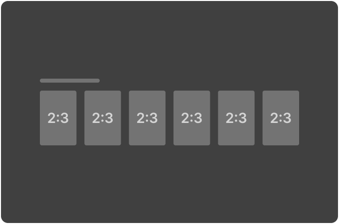
Standard strip instances
Standard 2:3
|
Appearance |
Key |
Values |
|
|
|
|
|
|
|
|
|
|
|
|
|
|
|
|
|
|
|
|
|
|
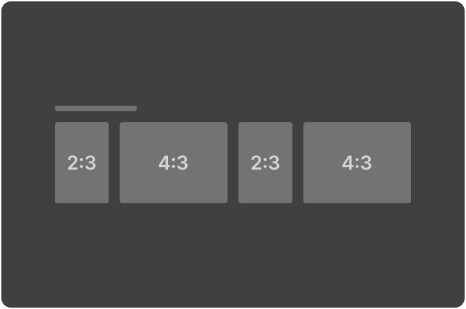
Standard 2:3 & 4:3
|
Appearance |
Key |
Values |
|
|
|
|
|
|
|
|
|
|
|
|
|
|
|
|
|
|
|
|
|
|
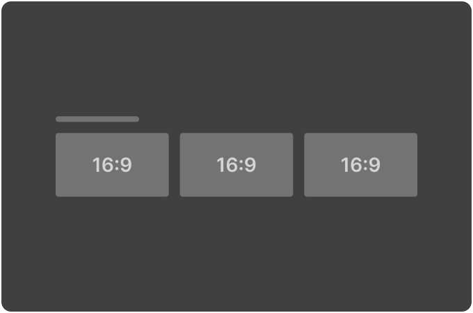
Standard 16:9
|
Appearance |
Key |
Values |
|
|
|
|
|
|
|
|
|
|
|
|
|
|
|
|
|
|
|
|
|
|
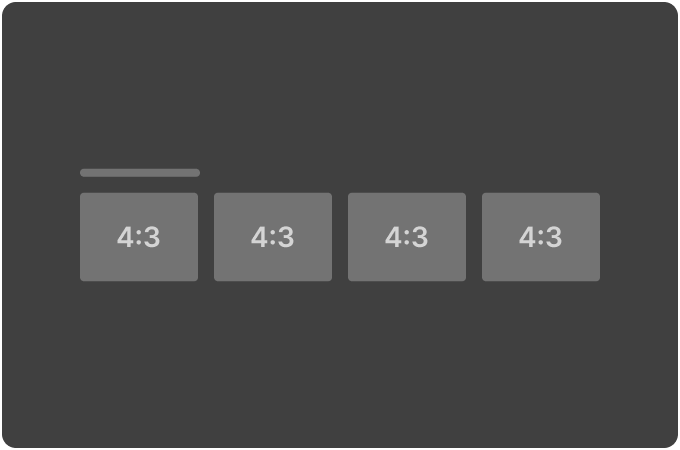
Standard 4:3
|
Appearance |
Key |
Values |
|
|
|
|
|
|
|
|
|
|
|
|
|
|
|
|
|
|
|
|
|
|