
The Purge dashboard contains two charts:
-
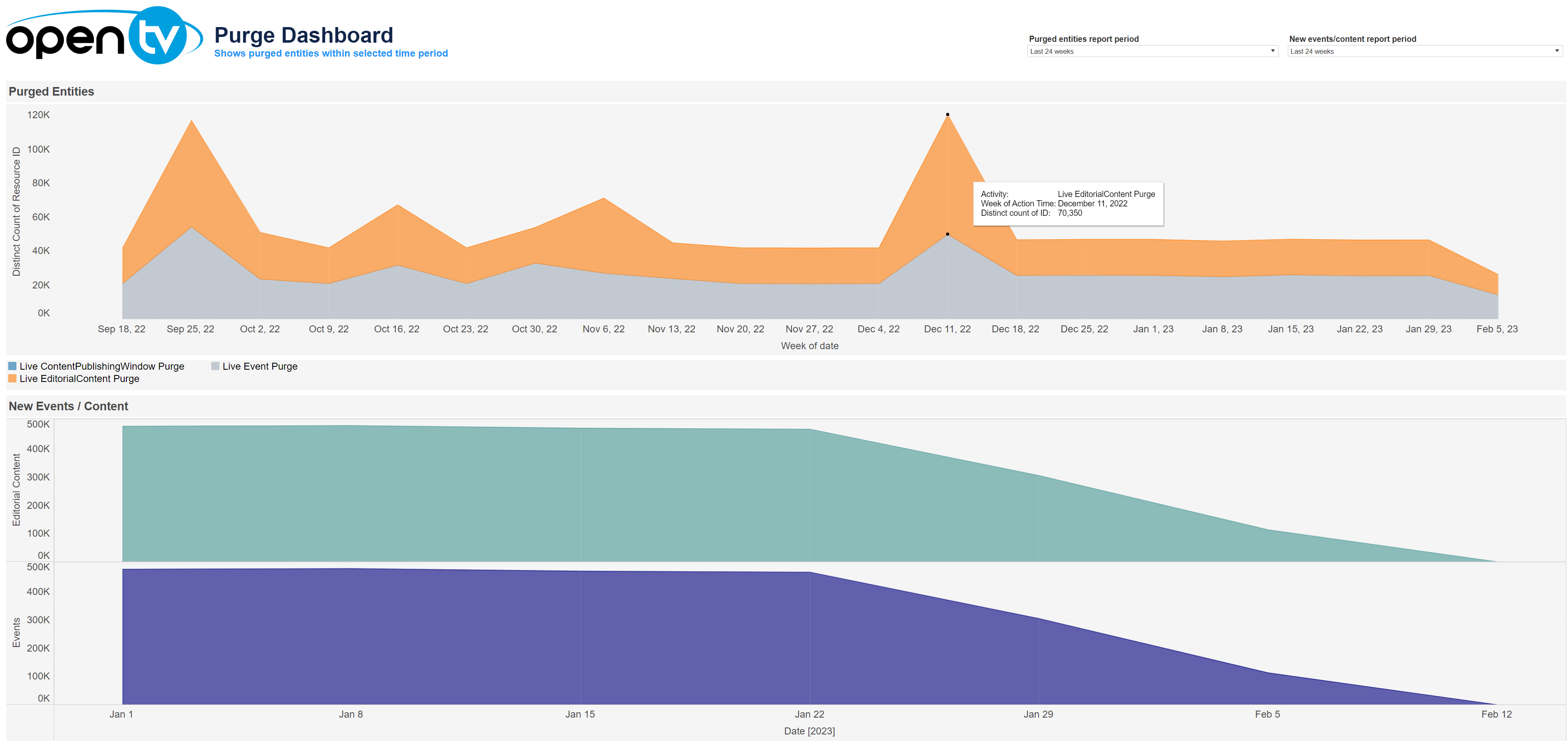
The Purged Entities chart shows the number of entities purged per week, broken down by entity type.
-
The New Events/Content shows the editorial content and events purged per week.
At the top of the page, you can:
-
Change the date range f.or each chart independently
In each tile, you can:
-
Hover over or click the data or chart to see additional information.
-
Click and continue hovering over the tile, then click

In this window, you can:See more detailed data, including (for some categories) a list of the accounts that comprise the total shown in the tile.Change the sort order.Show and hide fields.Change the number of rows displayed.Download the data.