
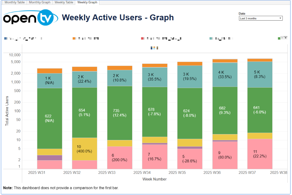
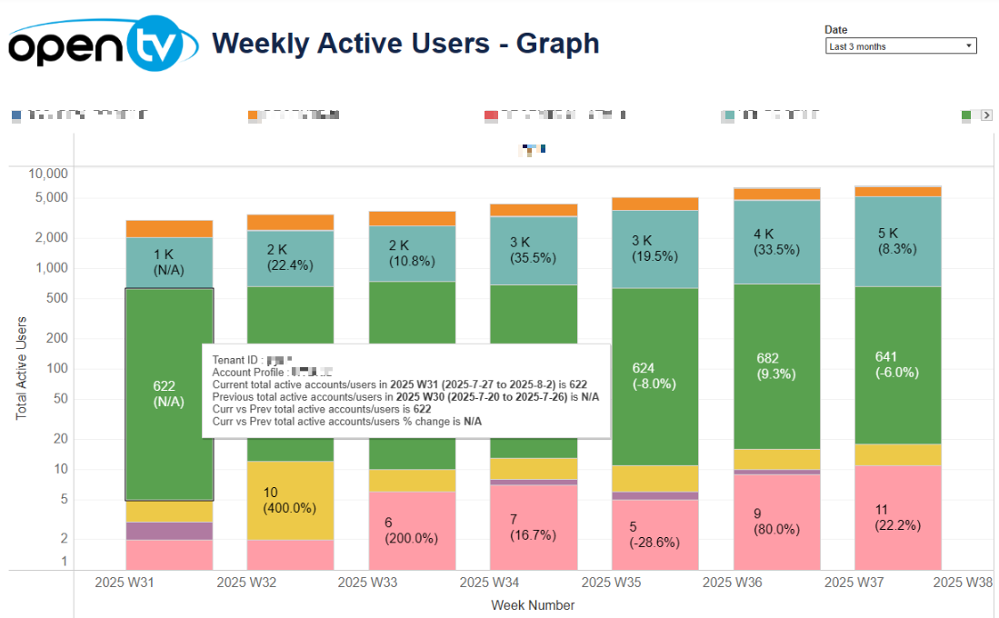
This page displays data by operator, profiles, and week, including active account count for the latest profile and current vs previous period percentage change.
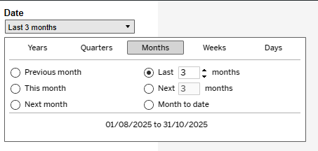
The top right of the page shows a Date drop-down menu. By default, data is filtered for the last three months, but users can adjust this using a relative date filter.
Billing Report Weekly Graph
The graph shows the active account count for the latest profile and current vs previous period percentage change for each week with in the selected period. The mouseover tooltip shows the specific week selected with the corresponding tenant ID, profile, current active account count, previous active account count, and current vs previous period percentage change. A legend is also shown above the graph.
The first bar in the graphs does not show a current vs previous comparison, as the date filter excludes data from prior periods needed for comparison.