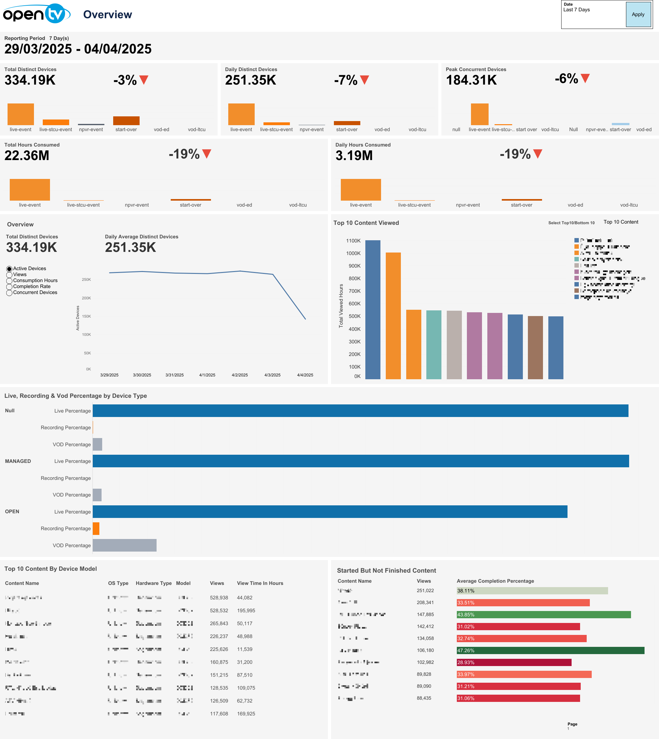
The first page provides an overview of the Audience Measurement for various TV metrics and analytics.
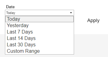
Date selection
The top-right of the page shows a Date drop-down menu, with preset time intervals for Today, Yesterday, Last 7 days, Last 14 days, and Last 30 days. Selecting one of these options then clicking Apply loads the data.
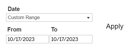
Users can also select Custom Range, which causes the From and To date fields to appear below it, and allows users to specify any time interval (provided dates are not in the future). Users must then click Apply to load the data.
Selecting a From date that lies in the future causes the Apply button to disappear:
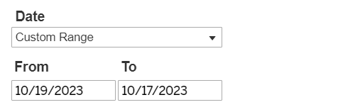
Below the top-left page title, the report shows the selected Reporting Period day count and specific dates chosen.

Total Distinct Devices
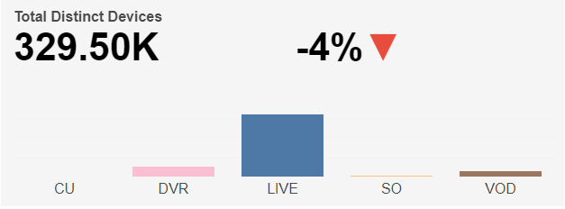
Below the top-left Reporting Period, the report shows a bar chart for Total Distinct Devices, split into five watch categories: CU, DVR, LIVE, SO, and VOD, based on the selected time interval.
The Total Distinct Device count based on the selected time interval is shown at the top left and the percentage change in Total Distinct Device count compared to the directly preceding time interval is shown with an up/down/neutral indicator arrow at the top right.
Individual regions can be highlighted by single-clicking. A mouseover tooltip for each measure gives further information and definitions.
Daily Distinct Devices
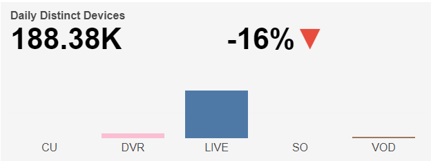
Next, the report shows a bar chart for Daily Distinct Devices, split into five watch categories: CU, DVR, LIVE, SO, and VOD, based on the selected time interval.
The Daily Distinct Device count based on the selected time interval is shown at the top left and the percentage change in Daily Distinct Device count compared to the directly preceding time interval is shown with an up/down/neutral indicator arrow in the top right.
Individual regions can be highlighted by single-clicking. A mouseover tooltip for each measure gives further information and definitions.
Peak Concurrent Devices
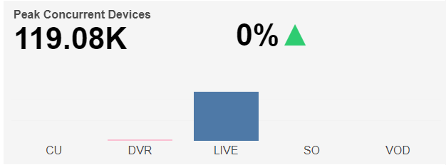
Next, the report shows a bar chart for Peak Concurrent Devices, split into five watch categories: CU, DVR, LIVE, SO and VOD, based on selected time interval. The Peak Concurrent Device count based on selected time interval is shown top-left and the percentage change in Peak Concurrent Device count compared to the directly preceding time interval is shown with an up/down/neutral indicator arrow top-right. Individual regions can be highlighted by single-clicking. A mouseover tooltip for each measure gives further information and definitions.
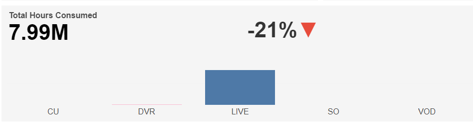
Total Hours Consumed
Below this, the report shows a bar chart for Total Hours Consumed, split into five watch categories: CU, DVR, LIVE, SO and VOD, based on selected time interval. The Total Hours Consumed based on selected time interval is shown top-left and the percentage change in Total Hours Consumed compared to the directly preceding time interval is shown with an up/down/neutral indicator arrow top-right. Individual regions can be highlighted by single-clicking. A mouseover tooltip for each measure gives further information and definitions.
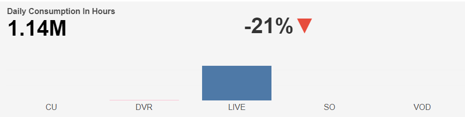
Daily Hours Consumed
Next, the report shows a bar chart for Daily Hours Consumed, split into five watch categories: CU, DVR, LIVE, SO and VOD, based on selected time interval. The Daily Hours Consumed based on selected time interval is shown top-left and the percentage change in Daily Hours Consumed compared to the directly preceding time interval is shown with an up/down/neutral indicator arrow top-right. Individual regions can be highlighted by single-clicking. A mouseover tooltip for each measure gives further information and definitions.
Overview
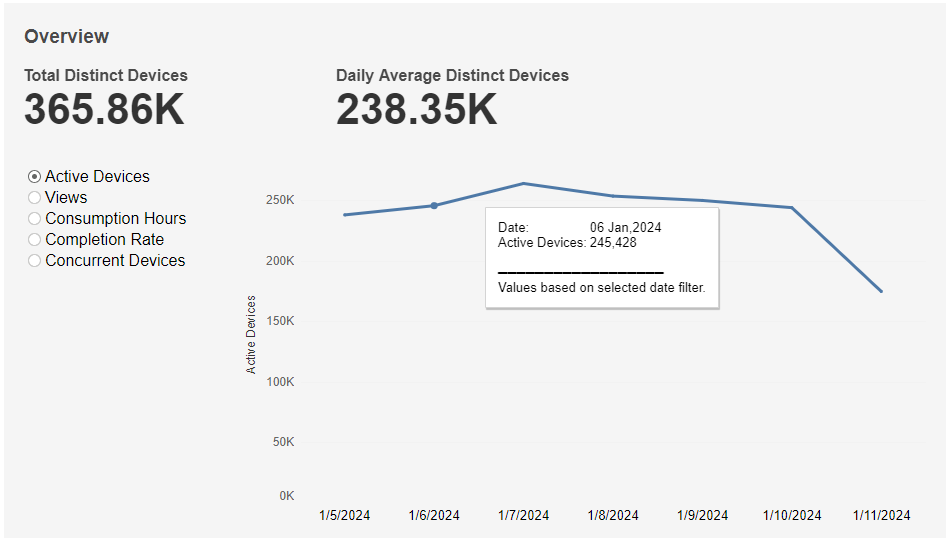
Active Devices graph
This graph shows Total Distinct Devices at the top-left, Daily Average Distinct Devices at the top-right and a graph of Active Device count over time based on the selected time interval. A mouseover tooltip gives further information.
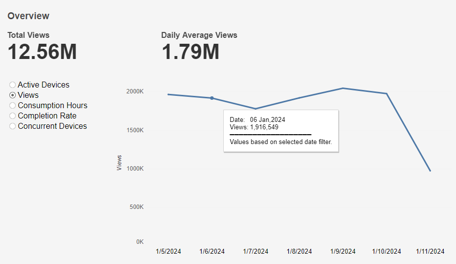
Views graph
This graph shows Total Views at the top-left, Daily Average Views at the top-right and a graph of Views over time based on the selected time interval. A mouseover tooltip gives further information.
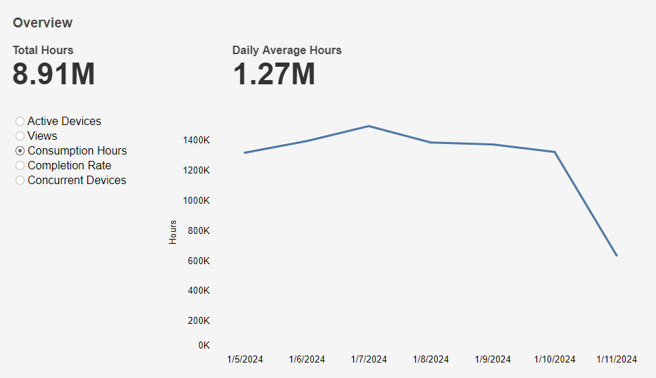
Consumption Hours graph
This graph shows Total Hours at the top-left, Daily Average Hours at the top-right and a graph of Consumption Hours over time based on the selected time interval. A mouseover tooltip gives further information.
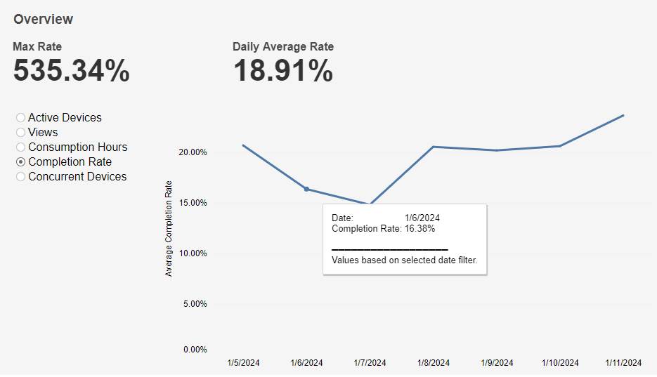
Completion Rate graph
This graph shows Max Completion Rate at the top-left, Daily Average Rate at the top-right and a graph of Completion Rate over time based on the selected time interval. A mouseover tooltip gives further information.
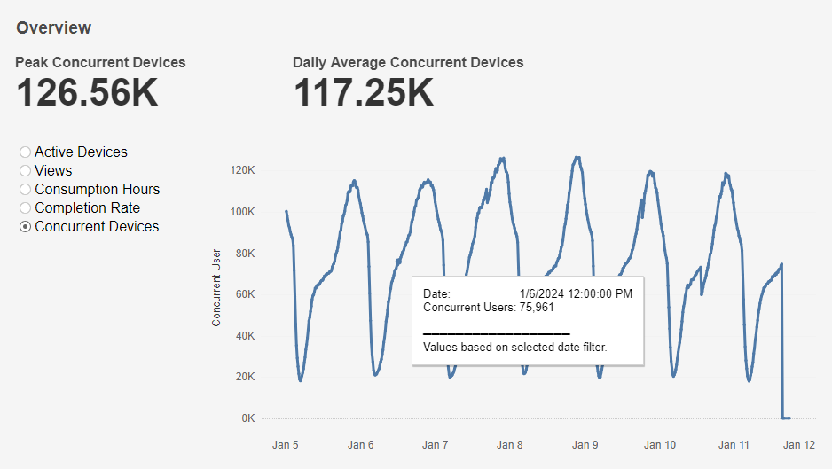
Concurrent Devices graph
This graph shows Peak Concurrent Devices at the top-left, Daily Average Concurrent Devices at the top-right and a graph of Concurrent Users over time based on the selected time interval. A mouseover tooltip gives further information.
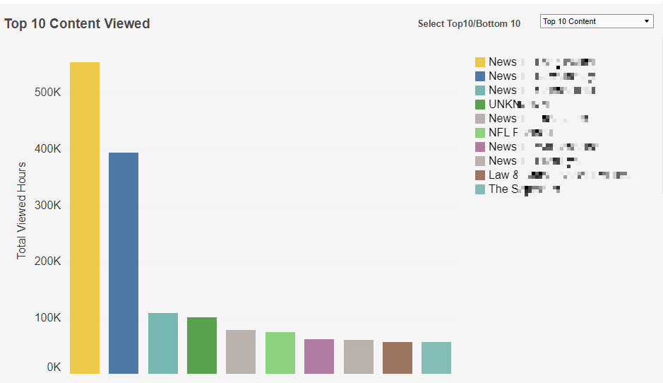
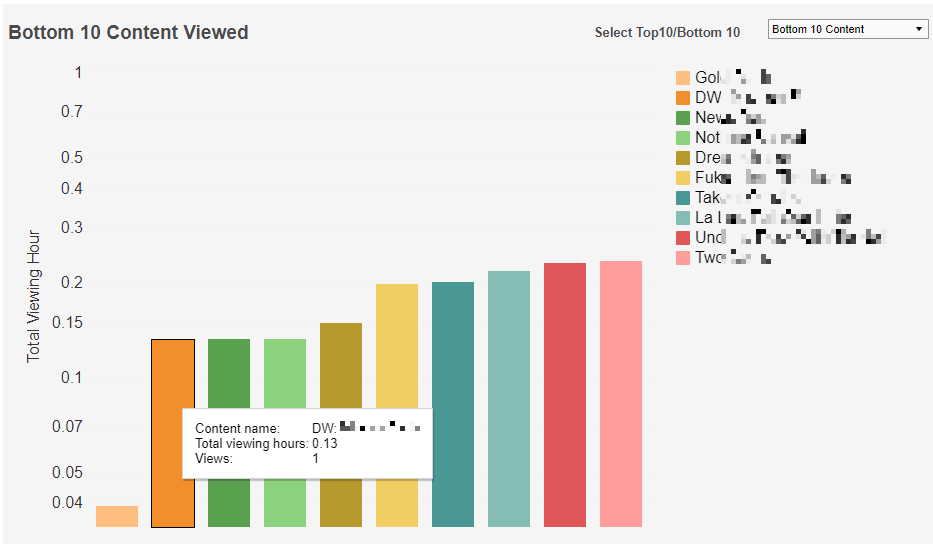
Top 10 Content Viewed
This chart ranks the Top/Bottom 10 Content by Total Viewing Hours within the selected time interval. A colour legend is shown to the right of the chart. A drop-down menu at the top-right allows users to select between Top/Bottom 10 Content. Individual bars can be highlighted by single-clicking. The mouseover tooltip gives further information.
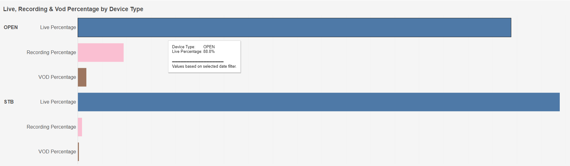
Live, Recording & VOD Percentage by Device Type
This chart shows the percentage split of each watch category (Live, Recording and VOD) for each device type (Open and STB) based on the selected time interval. Individual bars can be highlighted by single-clicking. The mouseover tooltip gives further information.
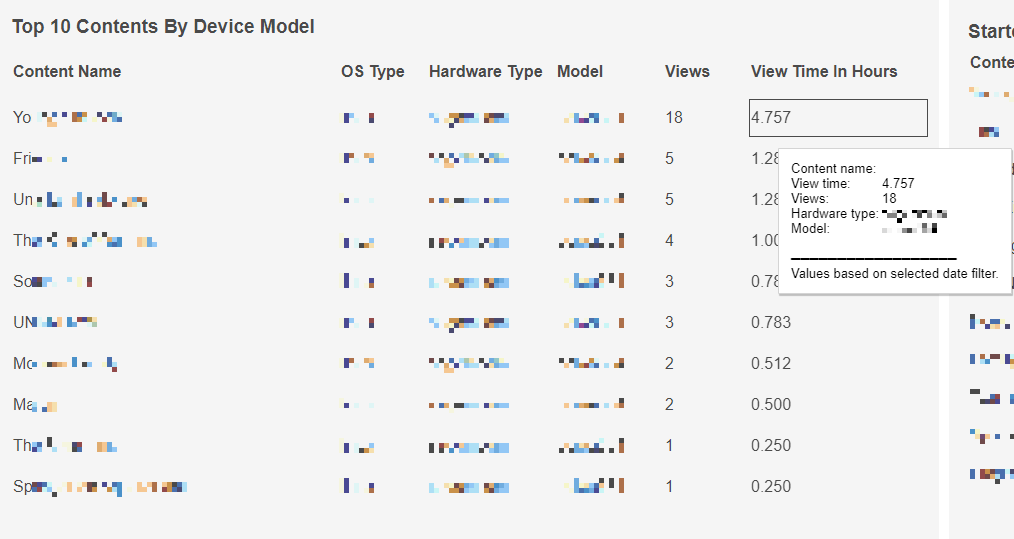
Top 10 Contents By Device Model
This table ranks Top 10 Content By Device Model by Views within the selected time interval. Individual rows can be highlighted by single-clicking. The mouseover tooltip gives further information when hovering over the View Time In Hours column.
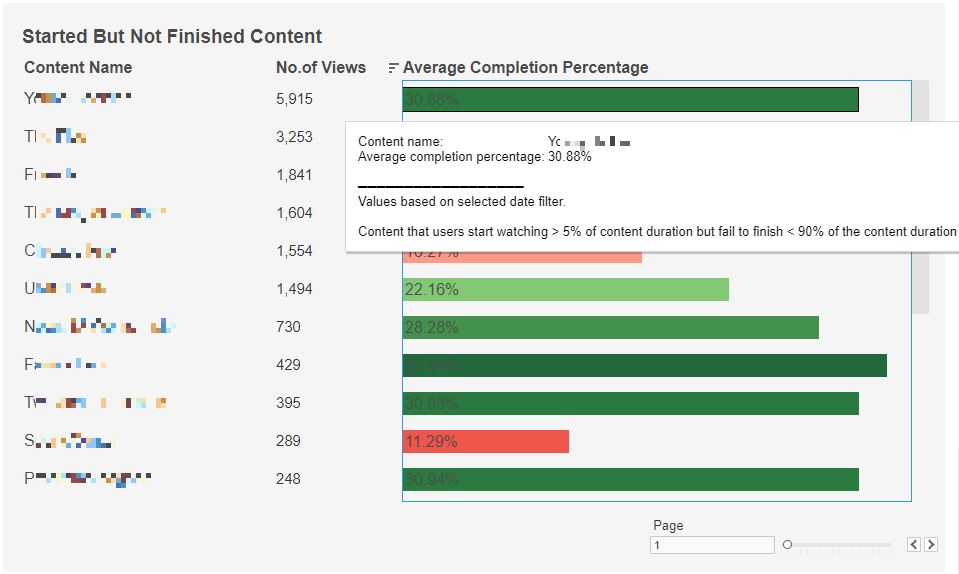
Started But Not Finished Content
This table ranks Started But Not Finished Content (any content with a watched percentage between 5% and 90%) by No. of Views. Individual rows can be highlighted by single-clicking. The mouseover tooltip gives further information when hovering over the Average Completion Percentage column. Users can navigate between pages using the Page select at the bottom-right.